Campbell’s redesigns soup can for first time in 50 years
The new logo is keeping the famous red and white design, but the Campbell's logo is receiving a "modernized logo scripture."
News 12 Staff
•
Jul 28, 2021, 2:27 PM
•
Updated 1,012 days ago
Share:
More Stories
0:59
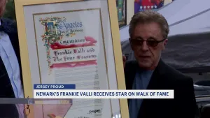
Jersey Buzz: Newark's Frankie Valli receives star on Hollywood Walk of Fame
44m ago1:55

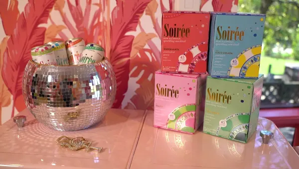
'Real Housewives' star Margaret Joseph's Soiree mocktail is Made In New Jersey
1h ago0:25

Officials: 2 firefighters hospitalized; dog dies in Wayne house fire
1h ago2:04

How to prepare for spotted lanternfly season
1h ago0:24

Police: 23-year-old man drowns at beach in Spring Lake
1h ago0:26

Three groups are suing New Jersey to block an offshore wind farm
1h ago0:59
Jersey Buzz: Newark's Frankie Valli receives star on Hollywood Walk of Fame
44m ago1:55
'Real Housewives' star Margaret Joseph's Soiree mocktail is Made In New Jersey
1h ago0:25
Officials: 2 firefighters hospitalized; dog dies in Wayne house fire
1h ago2:04
How to prepare for spotted lanternfly season
1h ago0:24
Police: 23-year-old man drowns at beach in Spring Lake
1h ago0:26
Three groups are suing New Jersey to block an offshore wind farm
1h agoFor the first time in 50 years, Campbell's soup cans
are getting a makeover!
The new logo is keeping the
famous red and white design, but the Campbell's logo is receiving a
"modernized logo scripture."
As part of this change, Campbell's is eliminating
the shadow and slightly changing its font, which is based on founder Joseph A.
Campbell's signature.
"The refreshed label still evokes the same
sense of comfort, goodness and Americana," the company said in a
statement.
Other changes to the design include the word
"soup" printed in a new font.